Show original
Try the app

napps エンタメありの永久無料ツール集
Enjoyed this article?
Support ntones (エヌトーンズ)
Share
AI translation
・インデックスページを大改修。 ・目的から使うのガイドページ追加
Try the app
napps エンタメありの永久無料ツール集
Enjoyed this article?
Support ntones (エヌトーンズ)
Why We Made These Changes
Until now, the screen simply displayed category buttons and a tool list side by side, which honestly tended to look uninspiring.
Our GA4 analytics also showed there was still room for improvement in reducing exits from the top page.
While the tools themselves were being used, we weren't reaching the point where users felt "I want to try this" at the initial entry point—that was the challenge we faced.
So we reviewed both discoverability and the overall site atmosphere.
Main Changes
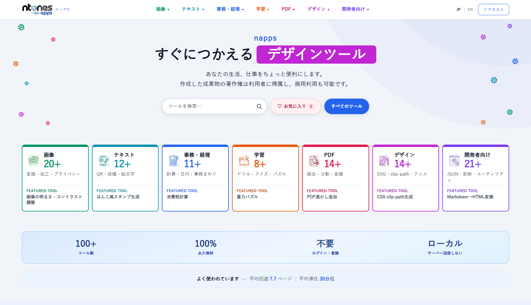
Redesigned the top page
- A hero section with a tagline and color-coded category chips that clearly communicates "ready-to-use ◯◯ tools"
- Navigation paths to search, favorites, and all tools
- Navigation paths from category cards directly into tools in that field
- Clear display of trust points like "permanently free," "no login required," and "local processing"
- "Popular Tools" based on actual GA4 usage data
- "Recommended Tools" curated by our team
- Request navigation as a pathway to deeper engagement
Beyond just appearance, we prioritized making it clear "what this site can do" and "what to click next."
Added "Use by Purpose" Guide
We added guides where you can follow steps based on what you want to do—like "I want to send PDFs securely" or "I want to prepare photos for social media."
Rather than just explaining individual tools, we guide you through the entire workflow before and after, so even first-time users should find it easy to understand where and how to use each tool.
You can access the full list from "Use by Purpose" on the top page.
What Stays the Same
・ 100% permanently free
・ No login or registration required
・ Input data is not sent to servers; it's processed within your browser
This policy remains unchanged, and we will never deviate from it in the future.
What's Next
We'll continue improving the top page while monitoring analytics. If you find anything difficult to use or want a particular type of entry point, we'd appreciate hearing about it through our request feature.
Thank you for continuing to use napps.
なぜ改修したか
これまでは、カテゴリボタンとツール一覧が並ぶだけの画面で、正直つまらなく見えやすかったと思います。
GA4の計測でも、トップからの離脱にはまだ改善の余地がありました。
ツール自体は使われているのに、最初の入口で「触ってみたい」まで届ききっていない、という課題です。
そこで、探しやすさと、サイトの雰囲気の両方を見直しました。
主な変更点
トップページを刷新
- キャッチコピーと、カテゴリ別の色付きチップで「すぐにつかえる◯◯ツール」が伝わるヒーロー
- 検索/お気に入り/すべてのツールへの導線
- カテゴリカードから、その分野のツールへすぐ入れる導線
- 永久無料・ログイン不要・ローカル処理などの信頼ポイントを明示
- GA4の利用実績に基づく「人気のあるツール」
- 運営おすすめの「おすすめツール」
- 下層への誘導としてのリクエスト導線
見た目だけでなく、「何ができるサイトか」「次に何を押せばいいか」が分かることを優先しています。
「目的から使う」ガイドを追加
「PDFを安全に送りたい」「SNS用に写真を整えたい」など、やりたいことから手順を追えるガイドを追加しました。
ツール単体の説明だけでなく、前後の段取りも含めて案内するので、初めての方でも使いどころが掴みやすいはずです。
トップの「目的から使う」から一覧へ進めます。
変わらないこと
・ 100% 永久無料
・ログイン・登録不要
・入力データはサーバーに送らず、ブラウザ内で処理
この方針はそのままで、今後ブレることはありません。
これから
トップの改善は、まだ計測を見ながら続けます。使いにくいところや「こういう入口が欲しい」があれば、リクエストから教えてもらえると助かります。
引き続き napps をよろしくお願いします。

