Show original
Try the app

HagePasha(ハゲパシャ)アプリ
Enjoyed this article?
Support Genki(薄毛悩み中)
Share
AI translation
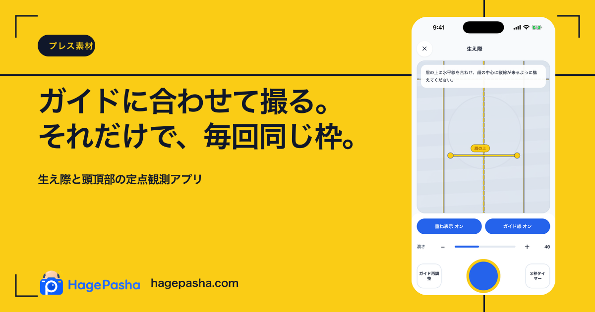
This is a record of trial and error for the first image visible on SNS in anticipation of HagePasha's overseas expansion.
Try the app
HagePasha(ハゲパシャ)アプリ
Enjoyed this article?
Support Genki(薄毛悩み中)
 HagePasha is an app where you photograph your hairline and crown in the same composition and compare them with your past self. I initially thought that if I carefully explained the features, people would understand it. But once I started thinking about overseas markets, I realized that first and foremost, whether "this app is for me" needs to be communicated in an instant—otherwise it won't reach people.
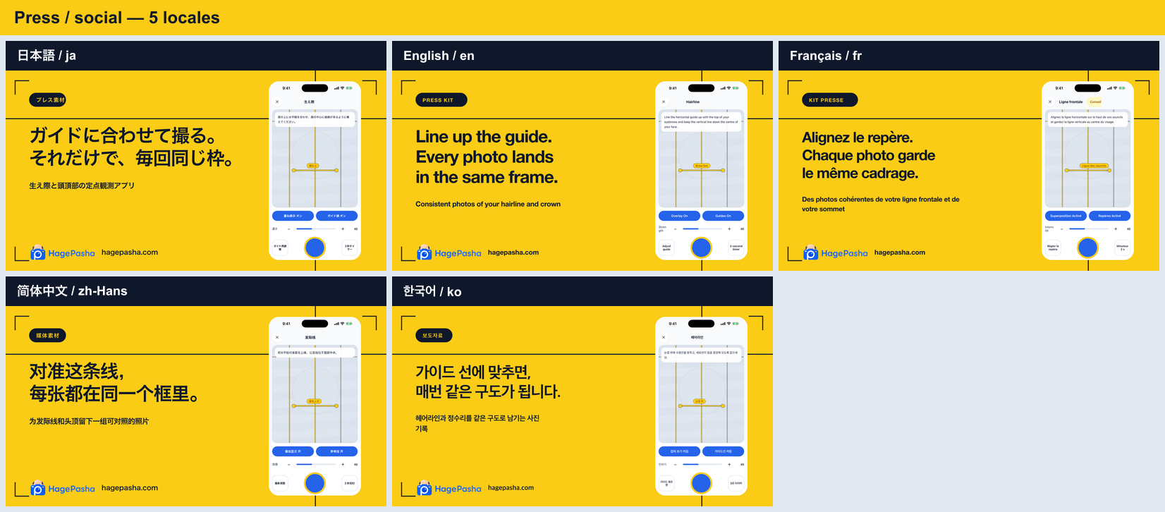
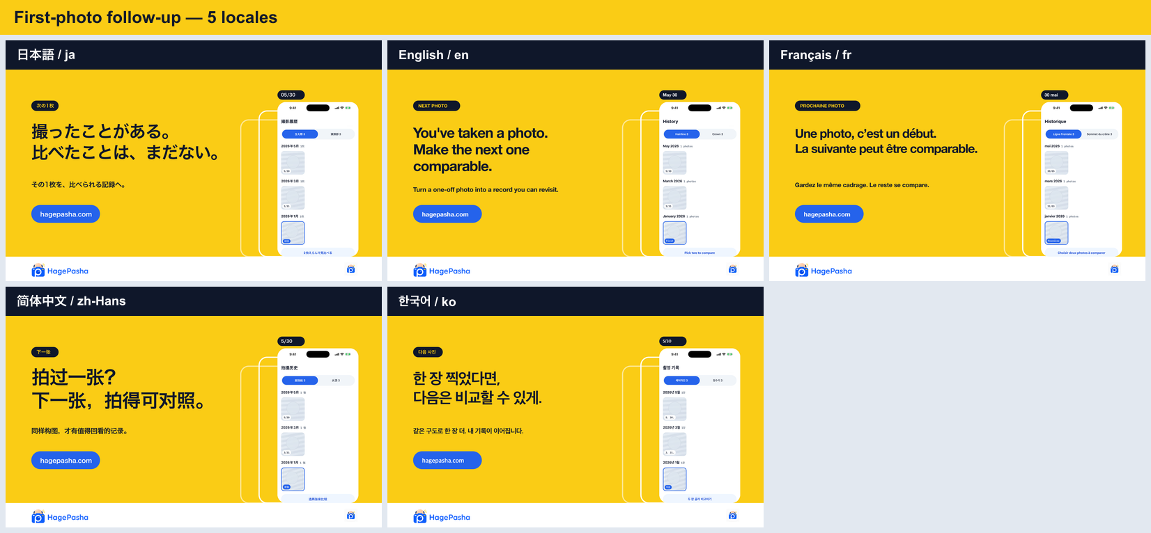 So I created several OGP variations, including Japanese and English versions. There was a proposal to place the app name prominently, another to convey what it does through short copy, and another to show the feel of the interface. Beyond just color and text size, I thought carefully about how much I could communicate in a single image—even the sense of distance, like "quietly continuing to record your concerns."
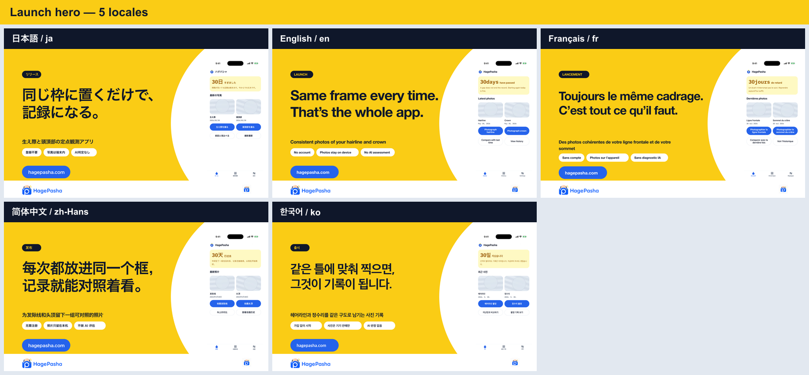 When I started creating OGPs, the app's promises—which had been vague during development—became clear. That it doesn't make medical judgments, that photos are saved locally on the device, that it's an app for comparison. Before adding features, the work of aligning "whose moment and what kind of moment we're helping" through words and visuals wasn't so much marketing as it was refining the product's outline.
How do you all create OGPs?"
Do you fix one image per app? Or do you vary them by feature page, update articles, and Japanese/English versions? I'm also curious whether you templatize the design or create it fresh each time. If you've had any success with OGP management in indie development, please share!
I had Codex give instructions to the Claude Design side to adjust the OGP itself!
HagePashaは、生え際と頭頂部を同じ構図で撮って、過去の自分と見比べるアプリです。機能を丁寧に説明すれば伝わると思っていたのですが、海外も意識し始めると、まず一瞬で「これは自分のためのアプリか」が伝わらないと届かないと感じました。
そこで、日本語版・英語版を含めていくつかOGPを作ってみました。アプリ名を大きく置く案、何ができるかを短いコピーで伝える案、画面の雰囲気を見せる案。色や文字の大きさだけでなく、「悩みの記録を静かに続けられる」という距離感まで、どこまで1枚で伝えるかを考えました。
OGPを作ってみると、開発中には曖昧だったアプリの約束が見えてきます。医療的な判定はしないこと、写真は端末内に保存されること、比較のためのアプリであること。機能を足す前に「誰の、どんな瞬間を助けるか」を言葉とビジュアルで揃える作業は、マーケティングというよりプロダクトの輪郭を整える時間でした。
みんなはOGPをどう作っていますか?」
アプリごとに1枚を固定していますか? それとも、機能ページ・更新記事・日本語/英語で出し分けていますか? デザインはテンプレート化するのか、毎回つくり込むのかも気になります。個人開発のOGP運用でうまくいったことがあれば、ぜひ教えてください。
OGP自体は CodexからClaudeDesign側に指示を出してもらって調整してもらいました!

